
It's been a longish week, so I'm going to try to focus on fun for today. Here are a few diversions for the end of the work week:
Layer Tennis
Maybe this is only fascinating to all of us PhotoShop nerds—watch it live today, or check out the archives.
CraftStylish
Make something fun this weekend—without the computer! This site has LOTS of ideas... if you're a craftster.
Hulu
Not at all design-related, but always fun to catch up on episodes of The Office and Arrested Development as a 20-minute break.
poppytalk
Read this blog. I do—every day—and wish I was this cool.
Friday, March 6, 2009

Thursday, March 5, 2009
I Love Letterpress!
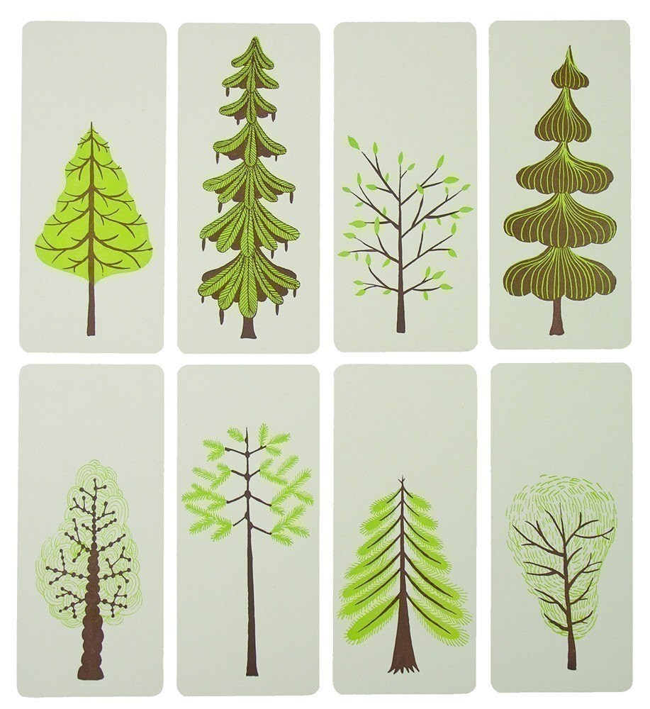

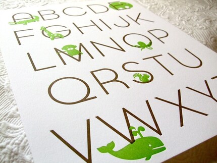 Oh, how I long to take a letterpress class. Back in my days at the Corcoran, we had one available to us in our screenprinting/bookbinding lab—and I never took advantage. How foolish of me! Now I'm nearly 3,000 miles away and yearning to print... but with no tools. In the meantime, I drool over others' letterpress lovelies and remind myself that soon, very soon, I will find a class and the time to learn.
Images, from top to bottom:
Tree prints from Yee Haw Industries
Triumph card from Egg Press
Alphabet poster from Sycamore Street Press
Wednesday, March 4, 2009
type like you mean it.
 I saw this poster on Creattica Daily last week and it made me chuckle. Perhaps it's just an inside joke for for us type freaks, but it illustrates what I consider to be one of the most important dilemmas designers face today—misused type!
With hundreds of sites devoted to providing free font downloads, it takes only a few minutes to expand your library with typefaces that ought not to EVER be used (or perhaps only used in the most perfect of circumstances). The fonts listed in the poster are another story, as they (or similar knockoffs) are available to anyone with a computer. And what's happened, is that your average computer user has decided that instead of using the default Times New Roman (that may require another post entirely), they can spice things up a bit and add a few display fonts—and always in inappropriate places. And in turn, they have become "designers."
The most obvious offender (in all of my years doing this) has got to be Papyrus. I am definitely guilty of using it in my early days (it was the 90's and I didn't know any better), but honestly... what does this typeface actually say about its user? And what makes it the go-to font for businesses these days? I recently drove through a small town and counted at least five businesses with signage (large signage!) set in Papyrus. This makes me wonder, who was responsible for the town's "official" font? I'm guessing it was the designer, which is even more shameful. I know many clients like Papyrus, but I find it's best not to even include it as an option. Next time you even consider using Papyrus, stop yourself. You are making a big mistake. And if you feel you need to use it just one more time, don't be surprised if one of those posters ends up at your door.
Using Budgets Wisely, or Rise of the Freelancer!
By now, the downturn of this economy has hit most of us... in some way or another. Perhaps we're dining out less, foregoing a vacation, or simply ignoring it all in the hope it will just go away. But more specifically, our economy seems to have provided an interesting environment for designers, especially freelancers.
When budgets are cut, creative departments are some of the first to go. Perhaps it's easier to justify holding off on that website redesign, rather than to neglect something a little more urgent—like increasing productivity (a.k.a: taking your executives on a retreat.) But then again, companies still paid $3 million for 30 seconds of Super Bowl advertising last month. It's just more evidence that corporate America is still willing to waste its money to look cool. One highly publicized example comes to mind—Tropicana's impersonal brand redesign (and subsequent return to its original design). This is probably the most appalling example in recent history of how a highly-recognizable brand attempted to completely abandon their customer base to "reinvent" itself as something it never was in the first place. It would be one thing if Tropicana succeeded, but their fan base raised their voices and the $35 million ($35 MILLION!) advertising budget seems to have been wasted—as Tropicana is now going back to their original "straw in the orange" design (thank goodness!). READ THE NY TIMES ARTICLE HERE
Such an example provokes so many questions. What were they thinking? How is it possible that companies still have $35 million to throw away on rebranding? But more importantly, why on earth should it cost so much?
I digress... the real reason I bring all of this up, is that in tough times, we all have to use what money we do have wisely. That's why good freelance designers are now in high demand. We're often less expensive than our counterparts, as we don't require as much overhead to stay in business (at least it's the case for my business, as I operate as a sole proprietor.) We can also offer something even more valuable—personal service. Having a direct line of communication between client and designer, without having to go through layers of project managers, strategists, art directors, etc. is worth a lot. Not only does this enable a project to be completed on a much shorter timeline, it often means a lot less frustration for both parties, as it's much easier to communicate one's vision directly, rather than have it distilled through several channels before finally ending up on a designer's desk.
So, what I'm getting at is this: it's a great time to be a freelancer—not just any freelancer, but a good one—responsible and reliable, with a little creativity mixed in for good measure.
When budgets are cut, creative departments are some of the first to go. Perhaps it's easier to justify holding off on that website redesign, rather than to neglect something a little more urgent—like increasing productivity (a.k.a: taking your executives on a retreat.) But then again, companies still paid $3 million for 30 seconds of Super Bowl advertising last month. It's just more evidence that corporate America is still willing to waste its money to look cool. One highly publicized example comes to mind—Tropicana's impersonal brand redesign (and subsequent return to its original design). This is probably the most appalling example in recent history of how a highly-recognizable brand attempted to completely abandon their customer base to "reinvent" itself as something it never was in the first place. It would be one thing if Tropicana succeeded, but their fan base raised their voices and the $35 million ($35 MILLION!) advertising budget seems to have been wasted—as Tropicana is now going back to their original "straw in the orange" design (thank goodness!). READ THE NY TIMES ARTICLE HERE
Such an example provokes so many questions. What were they thinking? How is it possible that companies still have $35 million to throw away on rebranding? But more importantly, why on earth should it cost so much?
I digress... the real reason I bring all of this up, is that in tough times, we all have to use what money we do have wisely. That's why good freelance designers are now in high demand. We're often less expensive than our counterparts, as we don't require as much overhead to stay in business (at least it's the case for my business, as I operate as a sole proprietor.) We can also offer something even more valuable—personal service. Having a direct line of communication between client and designer, without having to go through layers of project managers, strategists, art directors, etc. is worth a lot. Not only does this enable a project to be completed on a much shorter timeline, it often means a lot less frustration for both parties, as it's much easier to communicate one's vision directly, rather than have it distilled through several channels before finally ending up on a designer's desk.
So, what I'm getting at is this: it's a great time to be a freelancer—not just any freelancer, but a good one—responsible and reliable, with a little creativity mixed in for good measure.
Tuesday, March 3, 2009
And... I'm back.

 What seemed like just a few weeks, was nearly a two-month hiatus from writing. How did that happen? The answer: I have been busy, busy, busy... which is great, great, great! While not blogging, I have actually put my long-awaited printing supplies to good use. My first print went out as a very limited edition of Valentine's Day postcards–each one unique. Cutting linoleum is much more tedious than I remember, or perhaps it's just that my designs are a bit too intricate and/or ambitious for the medium. Next time, I'll remember to simplify! Up next is another set of prints with a spring theme (ambiguous, I know), as it seems appropriate now that it's March—yikes! More on that soon (hopefully)!
Subscribe to:
Posts (Atom)

